Made By Humans, For Humans
When we started building Chameleon, we knew we wanted to create an app that felt personal and human. In an era where AI-generated content is everywhere, we made a conscious decision: no AI art. Every visual element, every sound, every icon in Chameleon comes from the creativity and skill of real human artists.
Sounds that resonate
There’s something special about knowing that another human being put thought, care, and creativity into what you’re experiencing. When you successfully convert a file in Chameleon and hear that satisfying success chime, you’re hearing something crafted by Serban Matei, an accomplished sound designer based in the Netherlands. Serban carefully selected and edited sounds to match Chameleon’s “clean, minimal and classy” aesthetic.
As a Mac user himself, Serban understood the platform’s sound identity and designed notifications that feel at home alongside other macOS alerts. When an error occurs (hopefully rarely!), the gentle alert sound was also carefully designed by Serban to be informative without being jarring.
Branding that adapts
The Chameleon branding isn’t just a pretty picture generated by an algorithm. It was created by David Chodrishvili, a talented digital artist based in Georgia.1 David worked closely with us through multiple iterations, understanding our vision for branding that adapts to its context—just like a chameleon adapts to its environment. The result is a visual system that’s not just appealing, but meaningful: every curve and color choice was intentional.


David also created these variations for different contexts. The simplified glyph greets you in Chameleon’s file drop area, while the chameleon head serves as our favicon, perfect for small contexts like browser tabs where the full logo wouldn’t be recognizable. The head version features darker outlines for better legibility at smaller sizes, demonstrating David’s attention to functional design details. Each variation maintains the essence of our brand while being optimized for its specific use case.
Exploring artistic styles
We also commissioned Yogur Comics, a skilled pixel artist based in Argentina, to create their own interpretation of a chameleon. While we haven’t used this in the app yet, it was worthwhile to support another artist and explore how different creators interpret our brand.
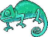
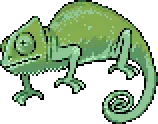
Yogur’s pixel art style brings a completely different energy to the chameleon concept—playful, retro, and distinctly human in its imperfect charm. Even though we haven’t found the right place for these designs yet, we enjoyed seeing how another artist would interpret our brand.
Icons that speak a universal language
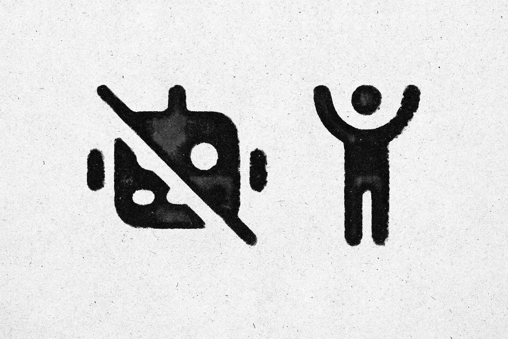
Throughout our website, you’ll notice clean, intuitive icons that help guide your experience. These come from Font Awesome. We chose Font Awesome specifically because they represent the best of human-centered design: simple, clear, and universally understandable. Each icon was thoughtfully designed to communicate its purpose at a glance.
You can see examples of these icons right at the top of this post: a slashed robot icon and a celebrating human figure that perfectly capture the essence of our message with just two simple symbols.
Why this matters
You might wonder why we’re making such a big deal about not using AI art. Here’s why it matters to us:
- Supporting Artists: Real artists need real work. By hiring human creators, we’re supporting livelihoods and careers.
- Authenticity: There’s an authenticity to human-made art that resonates on a deeper level. It has imperfections, personality, and soul.
- Collaboration: Working with human artists means we can collaborate, iterate, and create something truly unique. We can explain our vision and work together to bring it to life.
- Ethical Clarity: We don’t have to worry about whether the art we’re using was trained on someone else’s work without permission.
The Chameleon promise
When you use Chameleon, you’re not just using another faceless utility app. You’re using something crafted with care by humans, for humans. From Serban’s sounds to David’s logo to Jory’s icons, every element has been thoughtfully chosen or created.
We believe that in a world increasingly filled with generated content, there’s immense value in keeping the human element alive. It’s more expensive? Yes. More time-consuming? Absolutely. Worth it? Without question.
This is our commitment: Chameleon will always prioritize human creativity. Because at the end of the day, we’re building tools for people, and we believe people deserve the human touch.
Footnotes
-
You can explore more of David’s artistic range, including horror and realistic illustrations, in his ArtStation portfolio. ↩